
Understanding the Matrix
Each requirement was compared against the others and scored: 1 if more important, 0.5 if equally important, and 0 if less. Scores were totaled and ranked by priority.
Decision Matrix
The requirements were listed and the concepts, generated using a morphological matrix, were scored against them
You can read more about decision matrices here
JAN 2024 - DEC 2025
Designing a patient-first mental health care system that addresses the reasons therapy often fails
A patient-centric platform for better therapy matching and support.
FORM FACTORS
This concept is envisioned as a native app for iOS and Android devices.
TEAM
Solo
OUTCOME
High Fidelity Prototypes, Conceptual Work
PUBLISHED
Published & Presented at Cambridge University
CONTRIBUTION
UX & UI Design
User Research
Conversational Design
Design System
Illustrations
When therapy doesn’t align with a person’s unique needs, it can feel like starting over—again and again.
To understand gaps in mental health care, I conducted an observational study, market analysis, and literature review—then mapped everything through personas and an exploratory journey map to visualize the experience.
To better understand the challenge, I surveyed 88 people and conducted in-depth open interviews with 45. The goal: uncover what’s getting in the way of effective therapy—and how the experience could be improved. Here’s what came up:
I won’t bore you with how many hours I spent researching the problem, hunting down the right participants, and designing the surveys and interviews, but if you’re curious, it’s all lovingly documented in my research paper.

Incompatibility
Patients struggle to find a therapist they were compatible with.

Lack of Patient Feedback
Feedback from patients often goes unacknowledged

Financial Constraints
Financial constraints lead to therapy discontinuation

Lack of Informed Consent
Lack of prior structure or treatment information leaves patients uninformed
PRODUCT STRATEGY OVERVIEW
How different solutions were considered, digital, physical or otherwise, to arrive at the best one.
Although design isn't a linear process, here’s a simplified overview of how I progressed in the project, systematically and organized:
1
All the Data Gathered was Organized into Broader Themes
3
Testing Different Idea Combinations to Create Balanced Concepts
2
Analyzing the Data to Shape User Requirements
5
Zooming in on the selected concept to start working on the details
4
Evaluating & Selecting the Strongest Concept
PRODUCT STRATEGY: STEP ONE
All the data gathered was organized into broader themes.
Using surveys, patient interviews, field visits, and expert interviews, I gathered stories and experiences from people in therapy. Transcripts from these interviews were written on stickers and sorted into categories like ‘good first experiences’ and ‘things that went wrong’ to understand what made therapy feel helpful or difficult for them.

Above
Transcripts from interviews grouped by similar themes into larger categories
PRODUCT STRATEGY: STEP TWO
Analyzing the data to shape user requirements
These themes were then translated into user requirements to guide the design intervention—then prioritized using a prioritization matrix.


Above Left
Requirements created from the common themes found in patient and expert interviews, surveys, and field visits.
Above Right
A prioritization matrix showing which requirements have the biggest impact, helping decide what to focus on first.
PRODUCT STRATEGY: STEP THREE
Brainstorming Ideas to meet Each User Requirement
These themes were then translated into user requirements to guide the design intervention—then prioritized using a prioritization matrix.


Above Left
Brainstorming different ideas and solutions to address each user requirement from the research
Above Right
Each colored box groups similar ideas together. For example, all ideas about automating matches — like using AI or personality assessments — are placed under the ‘automating matches’ category.
PRODUCT STRATEGY: STEP FOUR
Testing Combinations to Shape Well-Rounded Concepts
Using the Morphological Matrix, these idea buckets were then mixed and matched to see which combinations worked best together. This process opened up new directions, challenged assumptions, and helped shape a more thoughtful, well-rounded concepts.
A total of four concepts were generated using this method.

Above
Ideas from different groups were mixed together to explore new and novel Concepts
PRODUCT STRATEGY: STEP FIVE
Evaluating All Concepts to Select the Strongest Concept
Using a Concept Evaluation Matrix, each concept was evaluated against the user requirements. If a concept met a requirement, it got a 1—if not, it got a 0. The concept with the highest total score (meaning it met the most requirements) was selected for further development.

Above
A decision matrix was used to compare each concept against the user requirements to see which ideas met the most requirements
CONCEPT DEVELOPMENT
Bringing the Concept to Life (and Back Again)
After selecting the strongest concept, the design process moved forward—one step (and one round of feedback) at a time.
1
Describing the Idea (then testing)
2
Mapping Use Cases and Information Architecture (then testing)
3
Designing User Flows and Wireframes (then testing)
4
Building Version 1 (then testing)
5
Realizing What Didn’t Work
6
Building Version 2
CONCEPT DEVELOPMENT: STEP ONE
Describing the Idea to Our Primary Users
Started with a clear description of the app and a storyboard to show how and when users would engage with it.
Shared with stakeholders, gathered feedback, & made updates.
CONCEPT DEVELOPMENT: STEP TWO
Mapping Use Cases and Information Architecture
Outlined the main use cases and built the app’s information architecture. Reviewed with stakeholders, refined based on feedback.


Above Left
Storyboarding the user’s experience with the app to show how it’s meant to help them, and using it to get feedback from users.
Above Right
Feedback from users was evaluated to see which suggestions aligned with the product’s goals and which ones didn’t
CONCEPT DEVELOPMENT: STEP THREE
Designing User Flows and Wireframes
Created user flows to map out key journeys, then sketched low-fidelity wireframes.
Presented for feedback again, adjusted flows and layouts
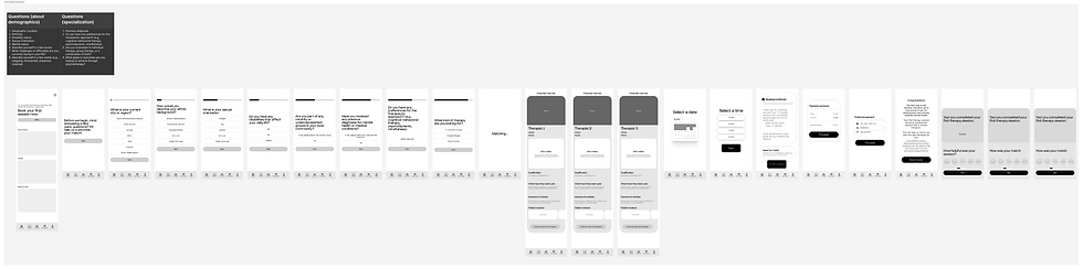

Above
Wireframes of the app created to gather feedback from users and improve the design.
CONCEPT DEVELOPMENT: STEP FOUR
Building Version 1
Assembled the first version of the app—layouts, colors, type, interactions.
Tested with users and stakeholders

Above
Version 1 of the app
Here’s what didn't work:
Fonts were hard to read (Italics), colors lacked accessibility, and overall usability and navigation wasn’t intuitive.
CONCEPT DEVELOPMENT: STEP FIVE
Iterating Toward Version 2
Reworked the entire design based on real feedback. With version 2, users could follow instructions clearly, and the experience felt much smoother.


Play Audio
CONVERSATION DESIGN
CBT & DBT-Based Self-Help Coach
A conversational AI guide delivering evidence-based CBT and DBT tools, dynamically personalizing each session.
Optional Opt-Outs — Explicitly allowing users to skip questions boosts positive sentiment by 22% (Headspace, Calm).
Text + Voice Input —Offering both increases disclosure rates by 1.4× in high-anxiety situations, while respecting user preference.
UI Tone & Layout —Neutral backgrounds reduce fatigue; clean, chat-like layouts improve familiarity and lower cognitive load.
THERAPIST MATCH
Two Input Systems & Clear Expectations
Tested for intuition — We asked, "What do you think happens when you click this?" and refined the design to match.
Two ways to share info — Users could choose between manual input or a guided path, depending on what felt easier.
Trust, by design — I made sure it was clear from the start: their data was private, safe, and only used to support them.


CONFIRM YOUR MATCH
Letting Users Preview Their Match Before Taking Action.
Video Introduction — Video intros from therapists build early trust, reduce onboarding anxiety, and improve match confidence — increasing engagement by up to 22% in digital mental health apps
Reviews — 61% of users felt safer selecting a therapist after reading peer reviews.
Personal Interests — 64% of users preferred therapist profiles with hobbies and interests for better personal alignment.


Making mood logs wearable-friendly captures more honest, timely data
SUPPORT GROUPS
Smartwatch mood logging and session feedback use ecological momentary assessment—shown to improve data accuracy and reduce recall bias in mental health apps
Research suggests ≥60% of users find smartwatch-based behavior nudges acceptable—delivering support exactly when needed, without reliance on phones
Lessons Learned
Do it right or do it Twice
Version 1 taught me that cutting corners early means double the work later.
Details are time consuming
The details will often take a long time, think about the 80/20 rule. It is best to design for the whole story first and worry about the details later.
Close collaboration with engineers team can push design exploration
Daily check-ins with the engineers helped me understand technical constraints early, pushing me to explore better alternatives.

Survey Response from individuals in therapy
Morphological Matrix
In case you're not familiar with morphological matrices, it is a simple tool to generate ideas and explore solutions by systematically combining different parameters and characteristics.
By mixing and matching these options, you can discover unexpected combinations and fresh ways forward

At first, I hand-drew the wireframes for quick validation with users. Based on their feedback, I then created digital wireframes with defined user flows.